Arthur Fouray’s “2080″ at ZQM in Berlin
Eleonora Castagna: The exhibition you are presenting at ZQM in Berlin (which was inaugurated on the 20th of May and will close on the 18th of June) was presented through several steps. One of the most important � and which I would define as a quite performative presentation � was the launch of the book �SCREEN�, published by Tombolo Presses and presented at Motto few days before the actual opening. Could you tell us more about the book and why it could be considered as a piece itself within the show?
Arthur Fouray: The publication acts as an interface. SCREEN is the exhibition catalogue of my first exhibition, Spectre, and the guide for the ongoing show 2080. If art pieces are mostly active when experienced by onlookers in an exhibition ecosystem, then the practice should be self-conscious of the possible keys it is able to give.
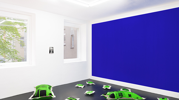
Inside the show, the SCREEN�publication appears through silk screened pillows covering the floor. These, as well as the book, are a figurative link between abstract painting and movie experience.
The Andy SCREEN (I, II, III)�pillows and the SCREEN�publication are two part of the same multimedia project. The third part is SCREEN Subtitles, a video which is the textual narrative of the expanded universe. The pillows, the book and the video produce echos in three contexts with specific purposes. The book, available in bookstores; the video, broadcasted on the web: both act as public faces for the project. Though silkscreens, the pillows complete a conceptual coherence between Spectre, SCREEN�and 2080.
EC: 2080: what about the title? Is it a date, a year? To me, it seemed like a datum to let the visitor enter a sort of platform, that presents a dystopian future.
AF: Yes, it’s a projection. This is the first element you encounter as a viewer. The title is conceived as independent from the show itself. It is meant to be read before experiencing the exhibition. 2080�acts as a prequel and propels the viewpoint toward dystopian thinking.
Yet the show has no relationship to anticipation stories, you are immersed inside a colorful universe, an overall stylistic appearance. The title framework is very discreetly expressed through the show, the only clear element would be the pillows associated with the organic plastic item on the floor. I began the exhibition with the will to present ruins on the floor. We could think of these silkscreened pillows as ruins of our contemporary culture.
EC: Blue, red and green: these are the three predominant colors of the exhibition. Could you explain me why?
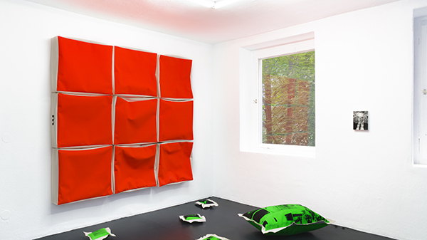
AF: The pillows are green, they are mainly linked to the SCREEN book cover but green has a lot of cinema analogies. The incrustation blue color belongs to a series of wallpaintings called 000fff. I use the #000fff hexadecimal color and incrustation blue paint, which both match a screen blue hue. 000fff�plays with the word “off”. The fluorescent red Genkins paintings began with the discovery of Jonathan Genkins in 2016, an artist who realized cushion painting works (no date known). I first encountered his work through a reddish orange painting.
The RGB colors are very logical when you consider the exhibition subject is screens. These three colors pinpoint distinct subjects: red, the viewer; green, the interface; blue, the projection. When you enter the exhibition, you first see the wallpainting, then the figuration on the pillows; lastly, when you turn back, you see the cushions/canvases, a “mise en ab�me” of the viewer. Red, green, and blue act as a cycle, as you mix colors when seeing the show.
EC: While you were presenting the book you said there is a reference to your previous exhibition too (�Spectre� at Espace Quark in Geneva, 2015). Could you explain me why?
AF: The book came out of the lack of documentation on the research I conducted for Spectre�in 2015. I dived into decoration history in order to find out how paintings were hung before picture rails during the Renaissance period. The result was so disappointing I became obsessed with the presence of monochromatic surfaces in interior designs since antiquity. I then compared it with screens and movie displays.
Screen and 2080�are two formats conceived independently. When working on the exhibition and the publication, the two projects joined. Their core thinking derives from the same alliance: monochromes and motion pictures.
EC: You are also a curator, and co-founder of the artist-run space Silicon Malley in Lausanne. You are co-curating the program of DOC, a space in Paris, which I would really like to know more about and present to our readers.
AF: Indeed. I co-curate shows at DOC Paris and I am co-founder of Silicon Malley, Prilly. We organize shows monthly in the two artist-run spaces. These two experiences are really active and fulfilling as I can encounter lots of ways to think exhibitions.
Silicon Malley is a really small space, 12 square meters, where we program solo exhibitions. Our exhibition space is located in the offices of Lausanne’s ex-slaughterhouse, next to our studios. For each show we are able to accurately focus on one artist’s practice. We generally invite them to play with the possibilities offered by a very free, sober and simple white cube context.
DOC Paris has a much larger space, 150 square meters, with a very high ceiling. The exhibition space used to be a gymnasium and is part of a huge complex of artist studios. Here we present solo and group shows, alongside concerts, theater pieces, and conferences. We often invite guest curators to extend the scope of our program. The principle behind the DOC exhibition space is to physically evolve through time. This way, artists and curators can react to a different space for each new exhibition.
EC: I would also like to know from you how much this double, defined role (artist-curator, or vice versa) influenced the way you work as an artist. Could you say you curate your exhibitions, too?
AF:�Totally. The 2080�exhibition is more a curation than a solo show. Each piece has a relationship to another artist or to specific works by other artists.
The A Brief History of Curating charcoal drawing is the clue to understand many artists who are included in the show. This drawing comes from a series where I connect an image to the format of a book, the two parts of the box unrelated to each other. The charcoal drawing copies a still image from Johnny Mnemonic, a movie by Robert Longo � who is mostly famous for his large charcoals.
To pursue this metaphor between blockbuster movie and blockbuster artist, the pillows on the floor showcase movie stills and art history images (from F�lix Gonz�lez-Torres to Dominique Gonzalez-Foerster, Sylvie Fleury, Alfred Hitchcock, and so on). The 000fff wallpainting associated with the aaafff painting is a reenactment of Grande Surface by IFP (1987-2010), a piece also silkscreened onto the Andy (SCREEN III) pillow. The aaafff�painting corresponds to size of one horizontal element from the stack series by Donald Judd (24x27x6 inch). The Genkins paintings are obviously linked to Jonathan Genkins, but also share the aaafff�format. A Donald Judd stack is composed of ten elements. 2080 decomposes these structures, while nine Genkins�are shown as one piece on the wall in front of one aaafff.
All my pieces are connected through curatorial linking. As I organize at least two shows each month, I can’t say this doesn’t influence my own art practice. When you are an artist and a curator, you have to feed your exhibition practice to propose coherent shows. I prefer to clearly use this interaction in my work, rather than separating the research fields. The 2080 exhibition equally proposes these two ways of thinking an exhibition, united.
Arthur Fouray: 2080�is at�ZQM, Berlin, through June 18, 2017
by Eleonora Castagna
in Focus on Europe
Jun 9, 2017


